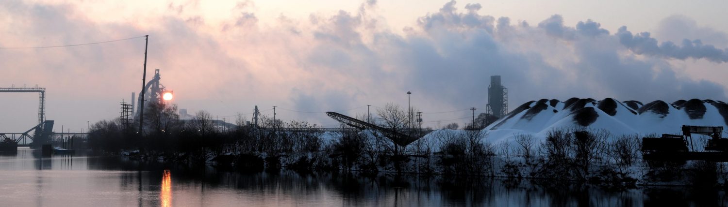
Midjourney Parameters: Style & Chaos In Speculative Urbanism
I’ve been working on a series of images in Midjourney trying to figure out ways to illustrate various elements of urban density, zoning, and infrastructure, and I wanted to publish some of the sort of outtakes from the series to show how the modification of the style parameter changes the actual image. The style parameter is included in the prompt (“–s [50-1000]”), with the number varying from 50 to 1000. Stylization isn’t well-explained in the Midjourney documentation except that it’s sort of the aesthetic version of delivering a sharper focus to the image. It’s a bold move, Cotton! Let’s see how this plays out! I also wanted to play around with the quality parameter (“–q [1 to 5]”).
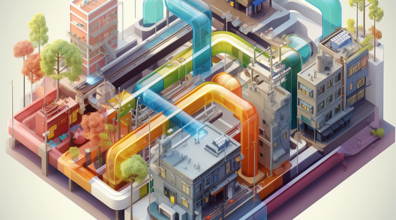
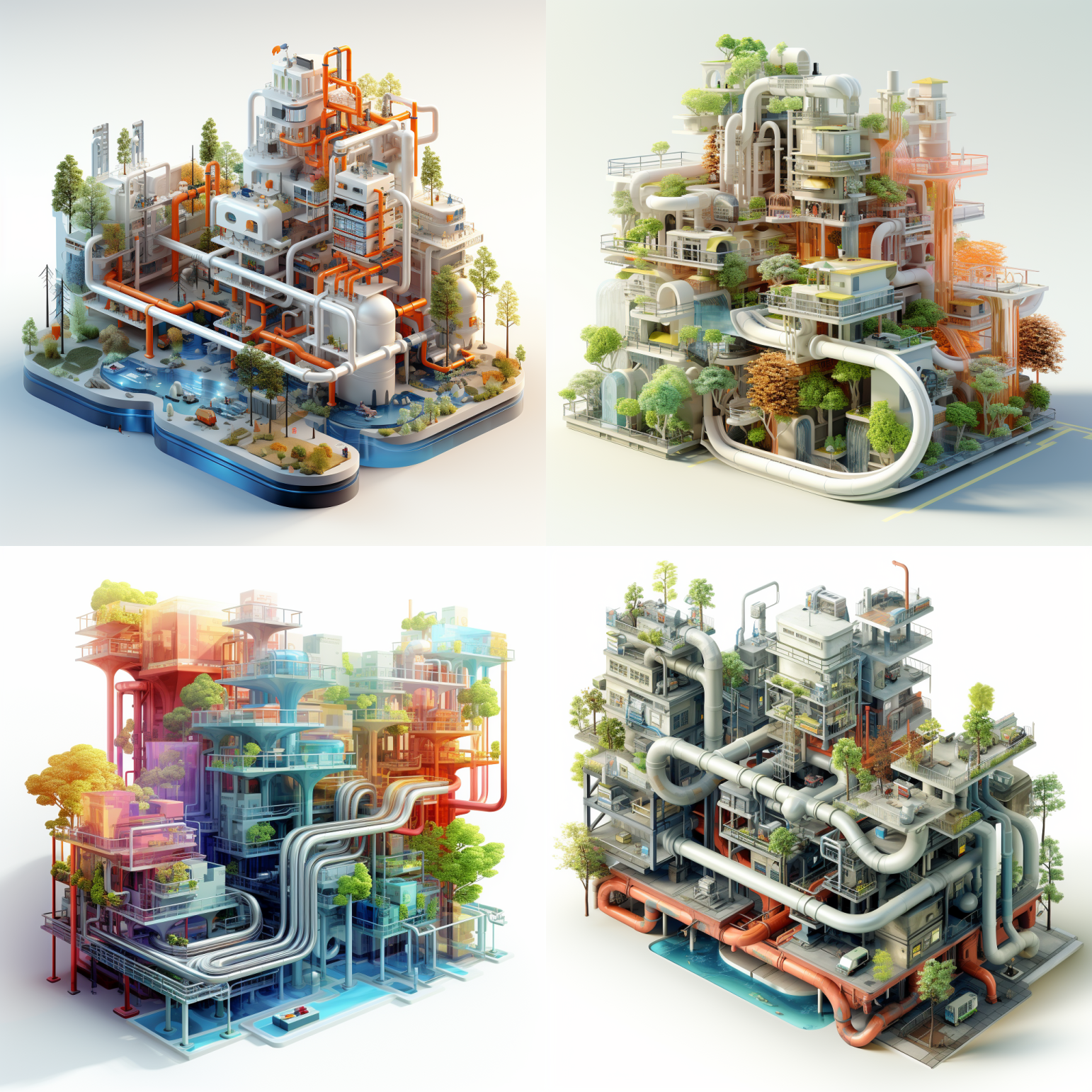
The prompt remains as simple as “isometric rendering on a white background, cutaway view of a city block, colorful translucent blocks, subway, pipes, trees.” But for each of these, I stepped up the “style” parameter.
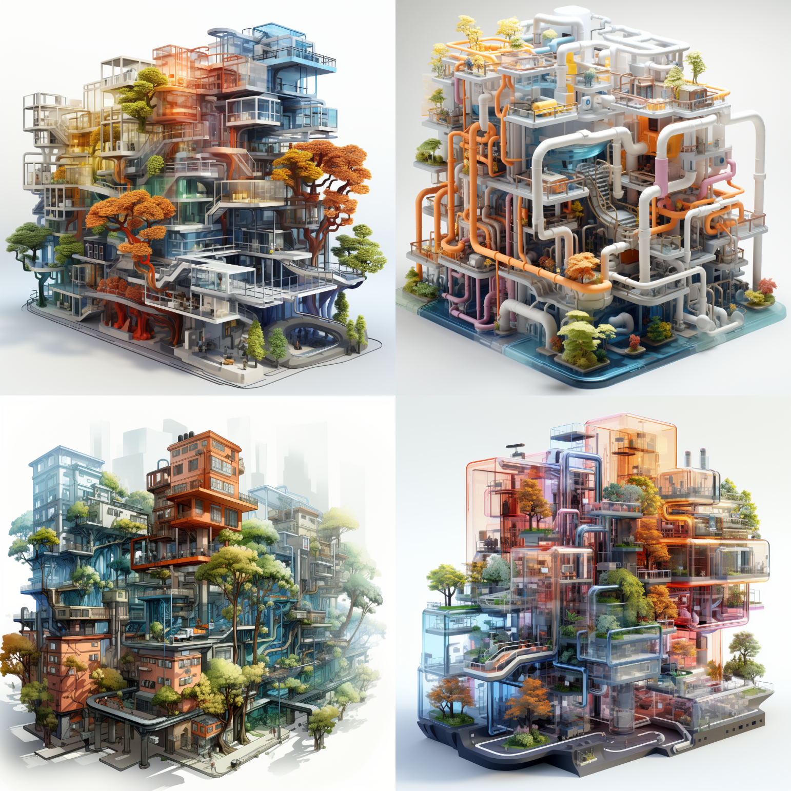
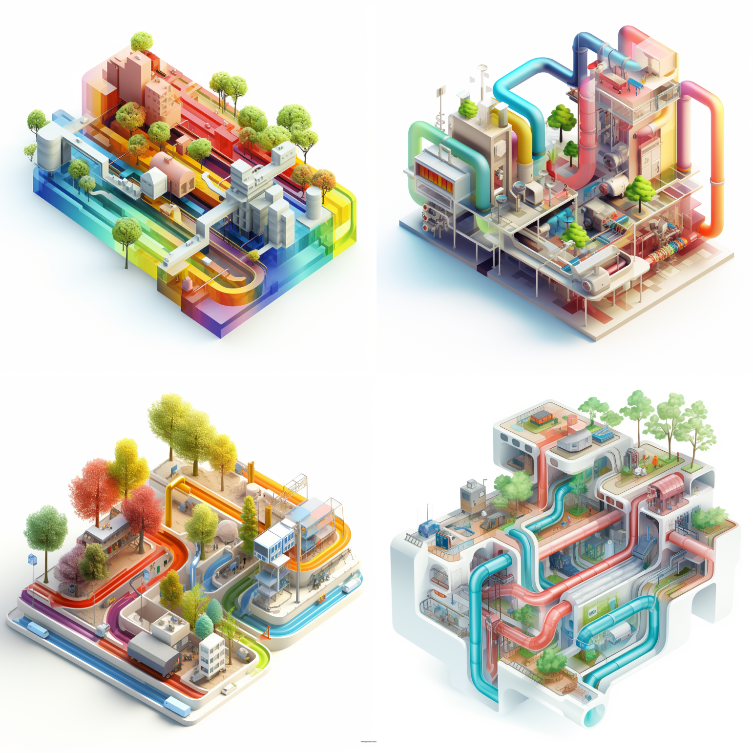
At the lowest possible level of the style parameter (–s 50), we see fully formed buildings. Shapes are crisp and well-defined, but note that the shading is fairly simple. This is generally what happens when you have the lowest style setting. You’re more likely to get something that is simple and leaves a light touch in terms of aesthetic depth or complexity. Note that the massing is super clean.
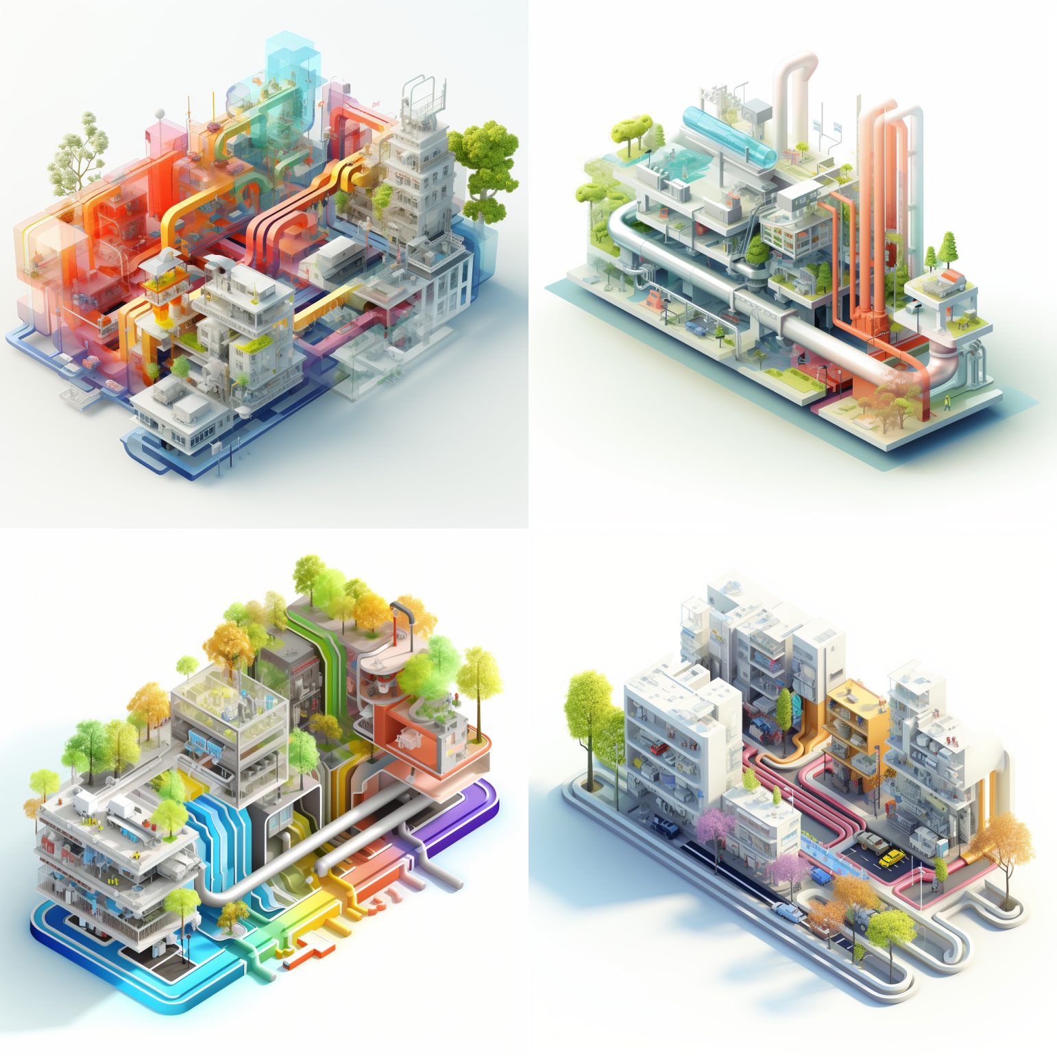
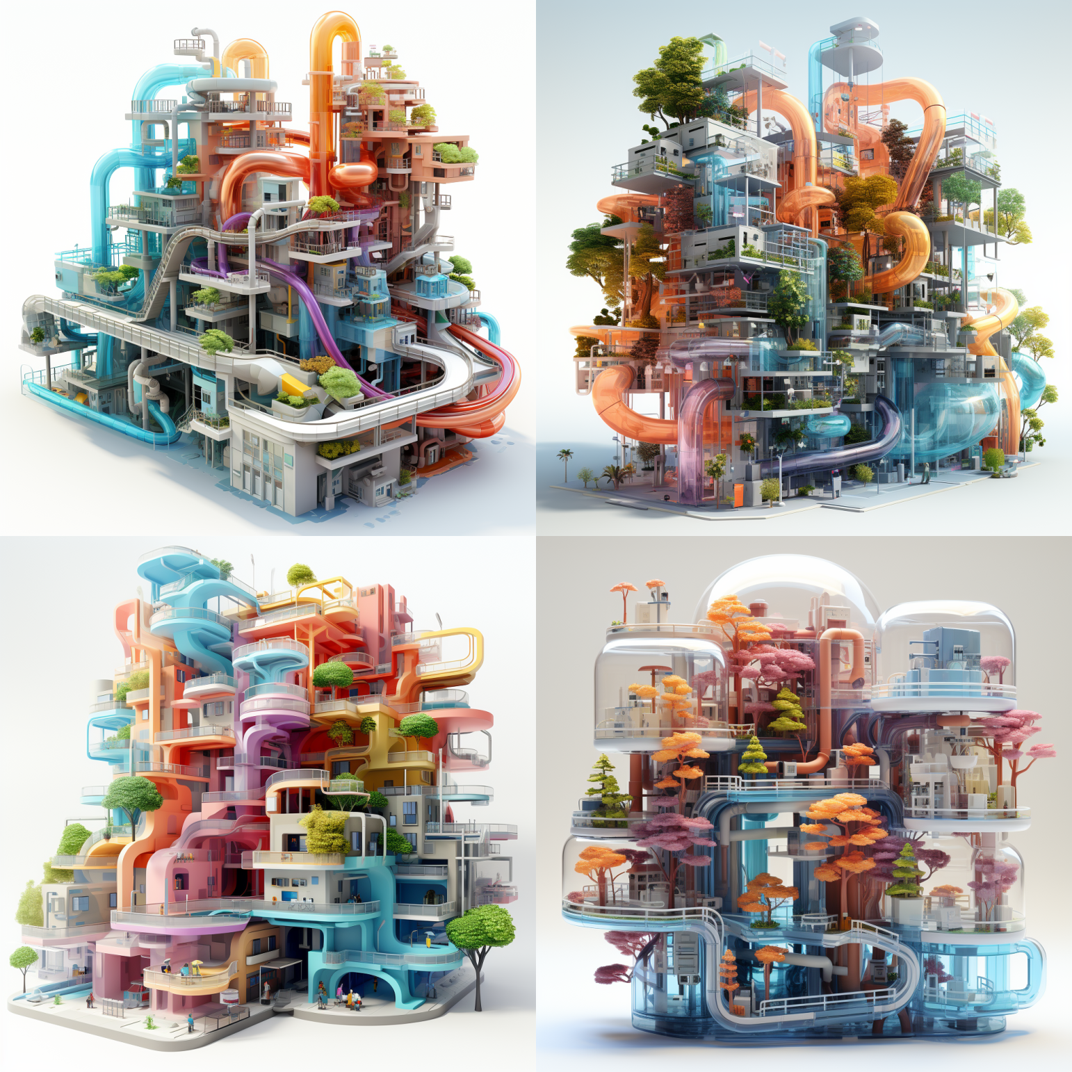
We’ve upped the style parameter to –s 250. While I immediately notice that these have more shading depth, the next thing I notice about these is that the perspective is a bit different. While I’ve specified an isometric rendering (an axonometric projection in which all of the distances along any of the axes are equal for any view, as opposed to things farther away looking smaller), these do not all appear quite isometric. Also note that the massing is much more detailed, ranging from the pipes (some of the pipes have joints in them, which are largely absent from the first quad).
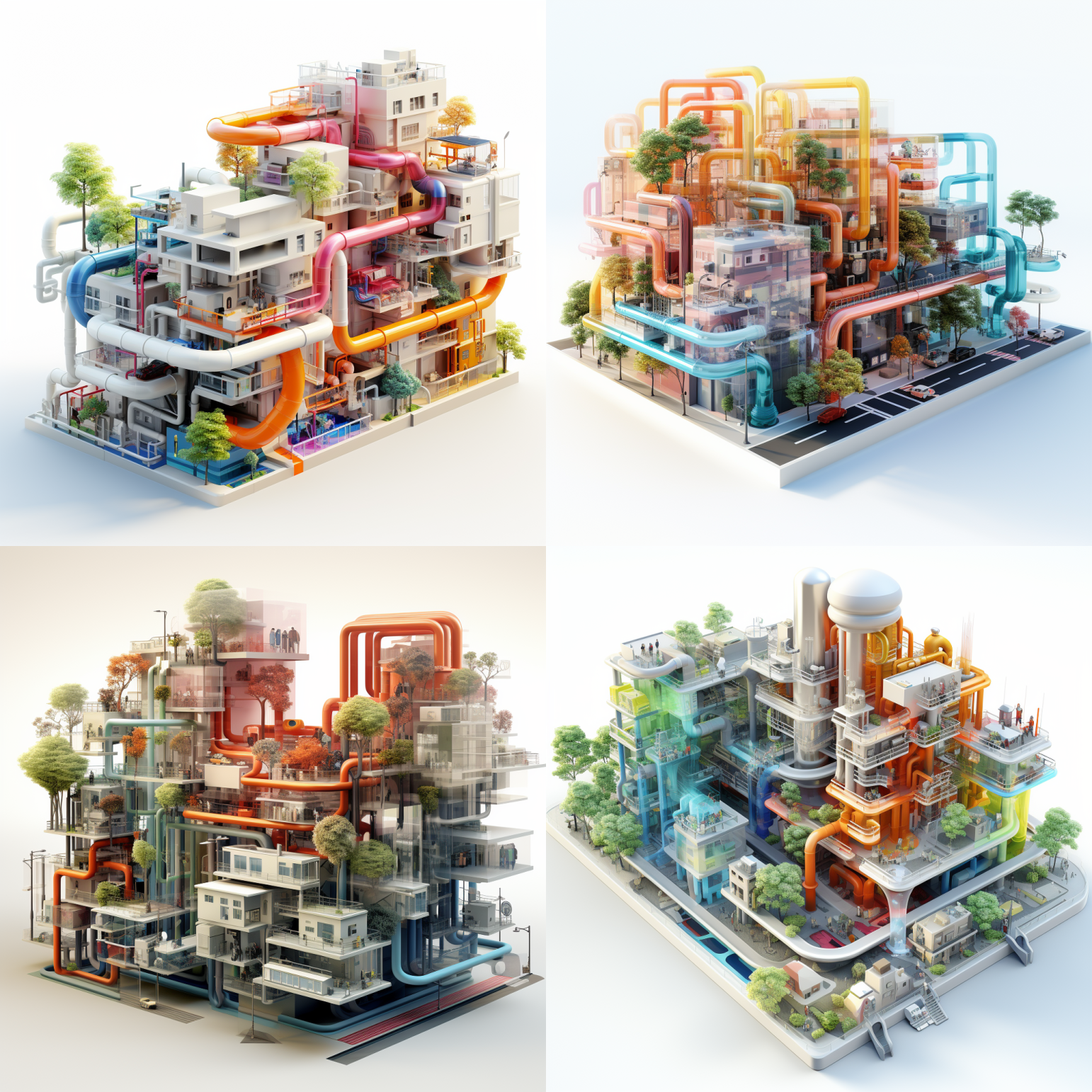
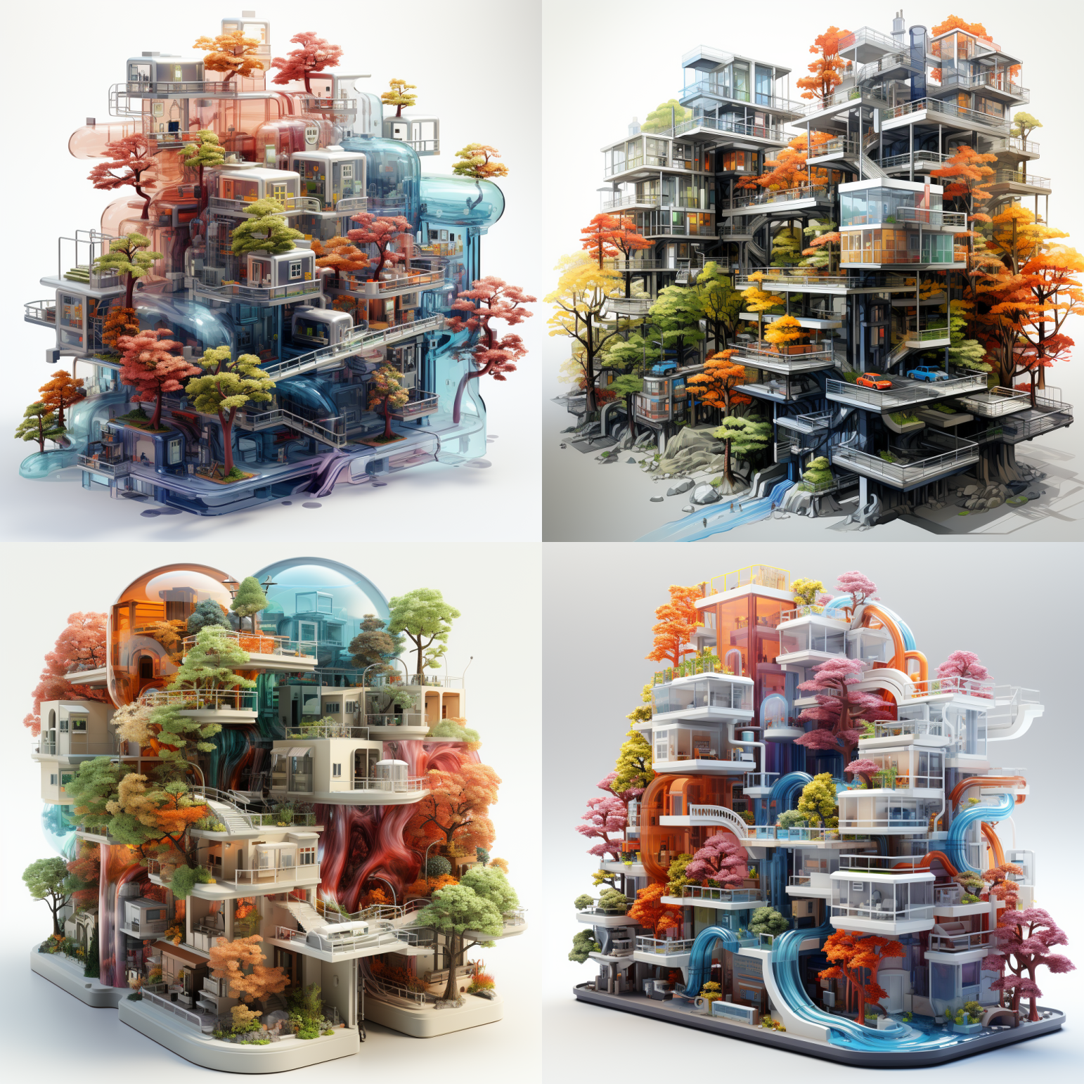
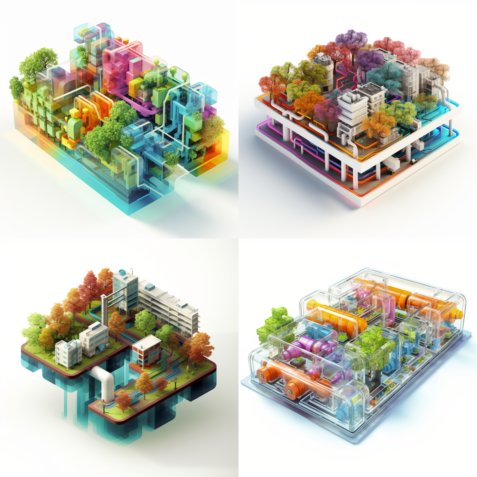
These are at –s 500. Note that in this one, the two images on the left side of the quad (1 & 3) don’t resemble as closely the other two as much because of the relative lack of rainbow colored pipes. This was a fun and defining feature of the previous two quads, but it’s also still present in the right side, while we have meanwhile gotten much more definition in the rendering of the buildings in #1 and 3. They’re also a bit more classic “jumbled illustration of a city,” especially #3. It gets wilder still!
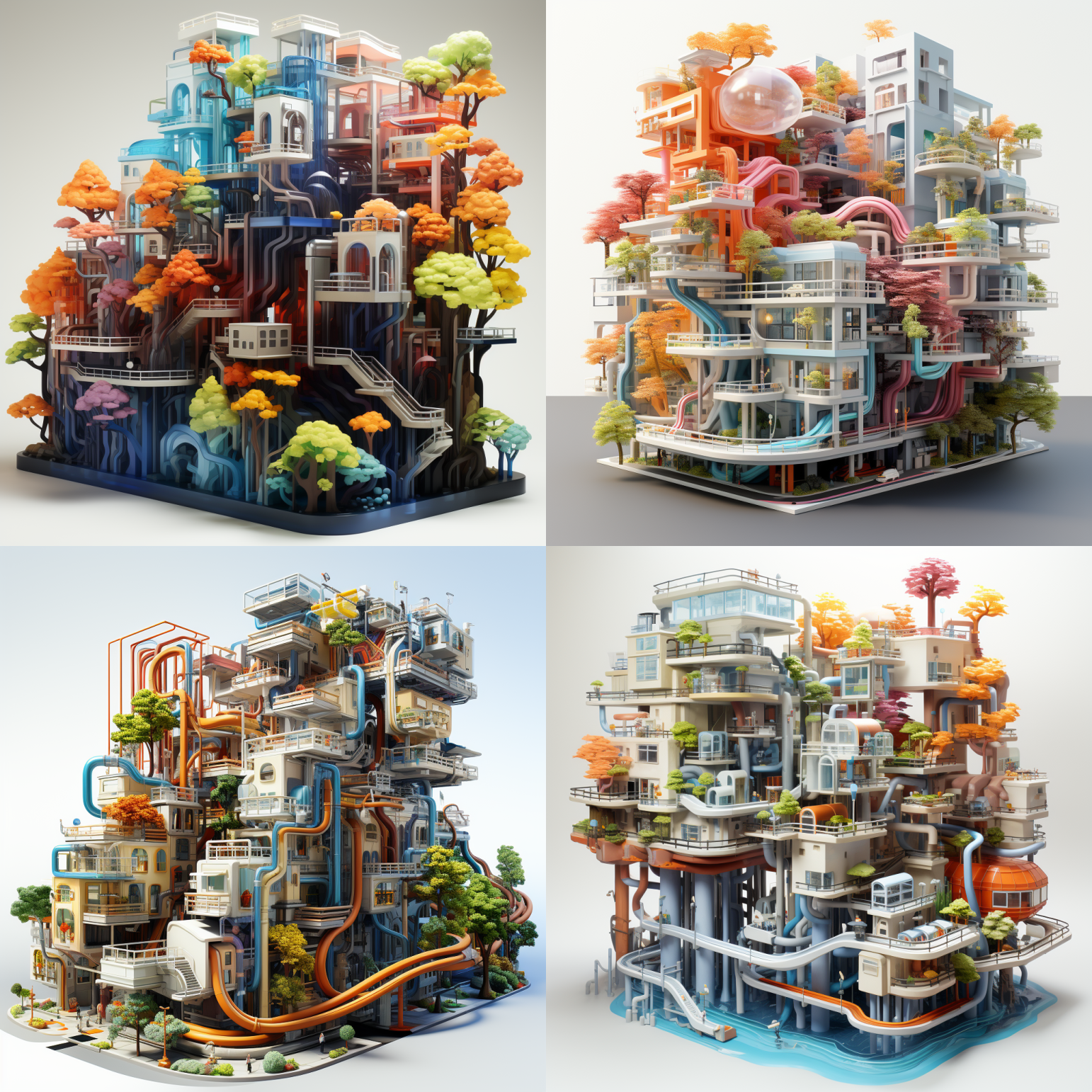
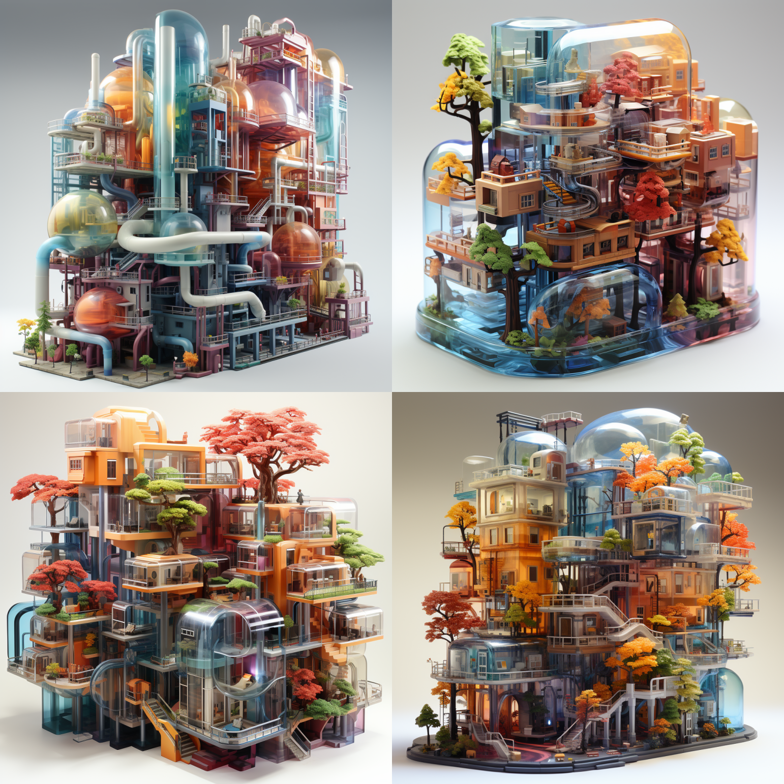
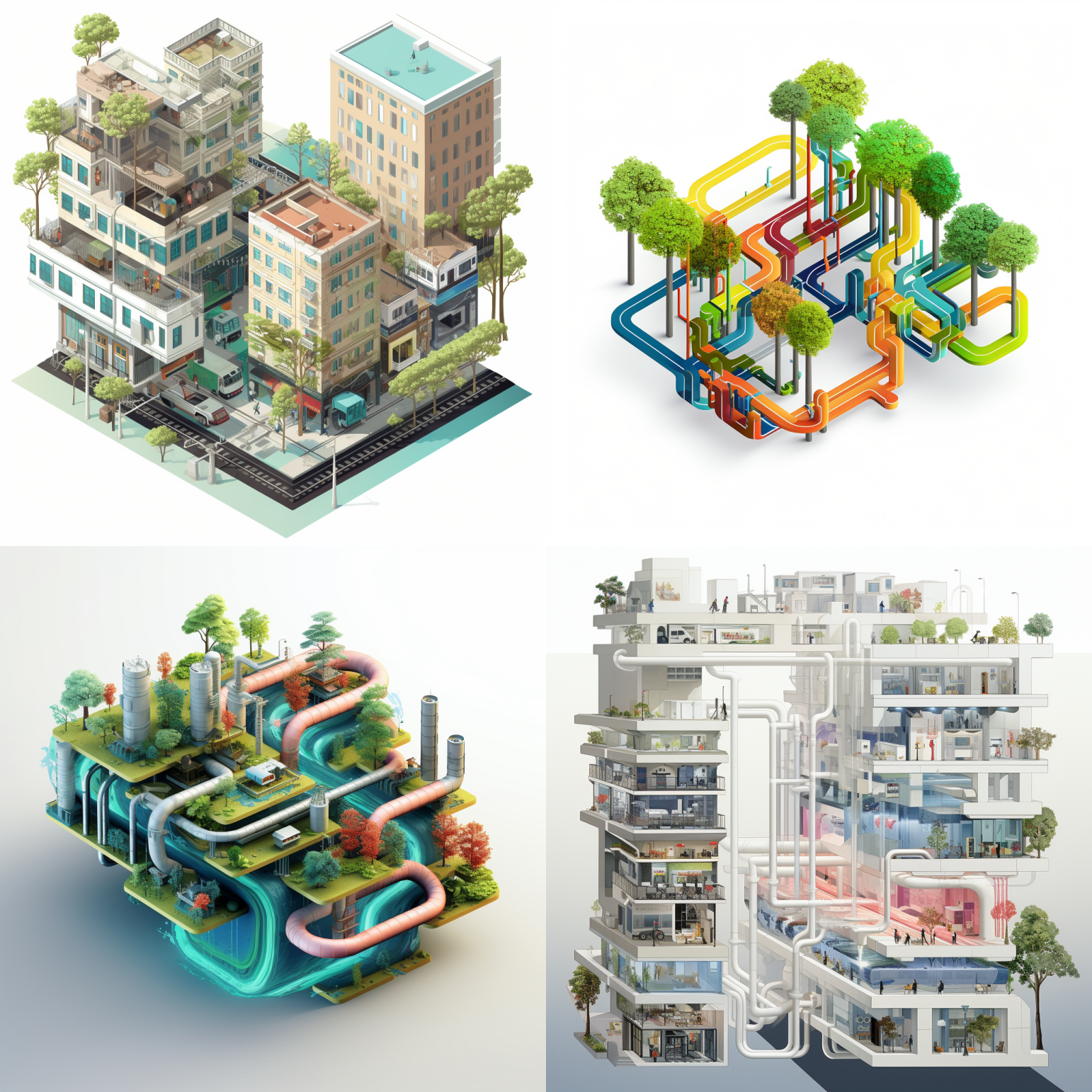
At –s 750, we’re getting super crisp, tightly constructed images. Compare these to –s 50 and they don’t feel quite as gentle, even if they are still playful– they’re hard shapes on the screen. None of these actually look realistic, of course, because they’re meant to be fantastical, but I note that #2 and #3 look pretty photorealistic in terms of the shading and depth.
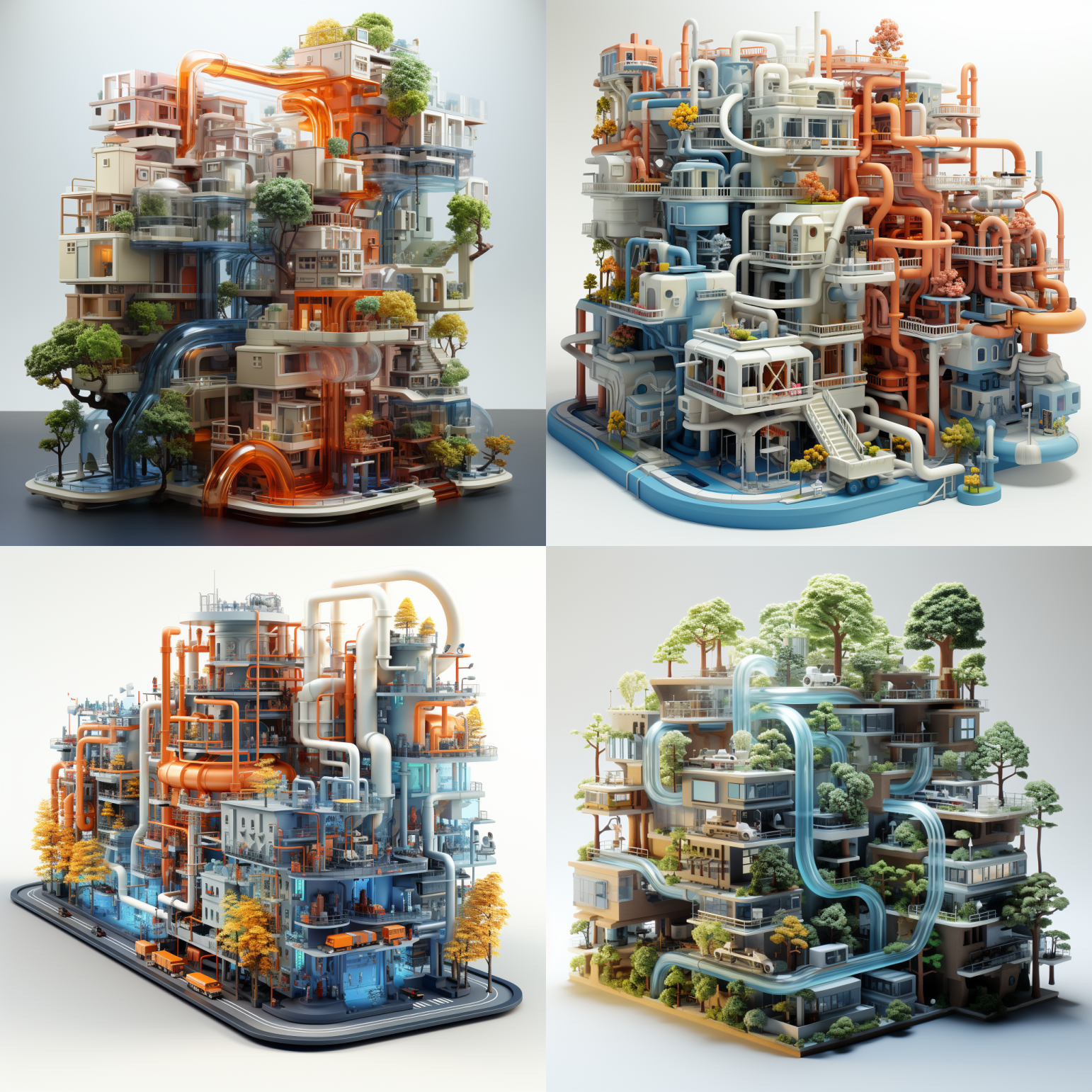
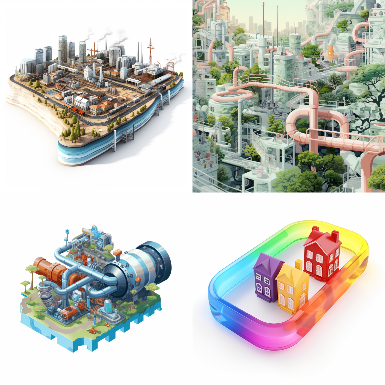
Finally, at –s 1000, maxing our our style parameter, we’ve gotten to the point where we’ve still got an image that is recognizable based on the original prompt, but we’re looking at weird shapes that have a whole lot of detail. It’s not really clear to me that #3 is even meant to be a city, as we have some objects that look like trucks, and we still ahve the pipes and infrastructure plus trees surrounding a little street or roadway type thing. Image #1, meanwhile, features some translucent hamster tubes, which are pretty neat, and the tubes in #4 look aqueous, like a waterpark built into an eco-communist utopian compound.
Next, we’re going to see what happens when we up the “quality” parameter (“–q [1-5]”).
The quality parameter increases the GPU time that is spent rendering the finished image. It’s meant to add a crisper, more finished look. In the above quad, I love the top two images here especially, although they look somewhat indistinguishable from the first round (–q 1). If you want to play around with the quality parameter, you can try doing a range of different images with –q 0.25 to –q 5. There’s a huge difference for some types of images.
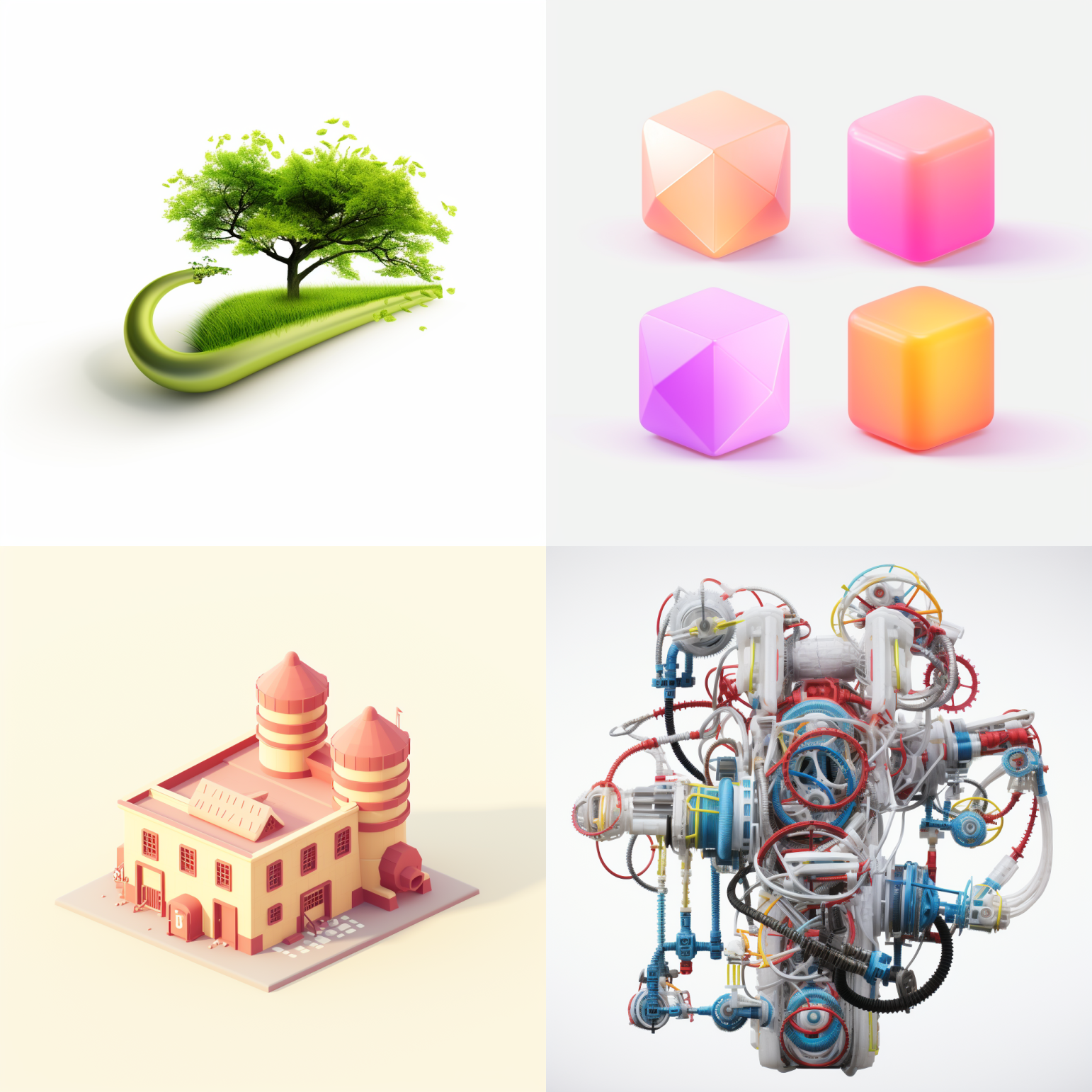
I’m not really sure what’s happening with these, whether we’re talking about the space-age waterpark in #1, or the rainbow refinery in #3. None of these look particularly city-y, though.
We’ve again moved away from more urban-looking setups, unless we’re thinking about highly speculative urban forms, like our Super Mario World glass dome setup in #4, or the hamster tubes that will be the zero-carbon transportation mode of tomorrow.
Again, I can’t really tell much difference with the q5 with these.
Increasing the quality doesn’t seem to have increased the sharpness substantially. It’s possible that this would show up better if these were enlarged, but it’s also possible that it wouldn’t make any visible difference. Unless you render with the exact same seeds, it’s hard to say one way or t’other. Interestingly, these all include a lot more glass, which is something that is more GPU-intensive to render (anything involving transparency or lighting).
Adjusting the chaos parameter is, as always, where things start to get interesting. We get some results that are fundamentally more interesting, and some that are just completely bizarre.
As I’ve written about in the past, I don’t really understand how this works from a technical standpoint and Midjourney frustratingly refuses to explain the inner workings of its machine, but I believe that it has something to do with how the model interprets the prompt language and increases some sort of internal measure of randomness or stochasticity. If you imagine language as having consistent rules and logical glue, the chaos parameter agitates the chemical bonds in that glue, stretching the meaning of individual words or phrases toward a bit more flexible horizons. A great deal has been written about how generative AI “tokenizes” language before indexing that language into a multidimensional grid to figure out how to respond to the prompt. I suspect that chaos increases the flexibility of the “interpretation” in this process of tokenization.
The chaos parameter doesn’t really make sense, and that’s kind of the point. By the time we hit –c 100, the images in the quad are mostly unrecognizable from the original prompt.
Again, these are pretty similar to our s50 q1 and q5 s50 images. They really love rainbows! It’s the woke agenda! Look out! I’m not sure if I’m reading too much into this, but these look less like a proper city than the original renderings at –c 5.
At c10, we’ve got a decent resemblance to the originals. I often will up the chaos to 10-20 if I want to stretch my renderings a bit outside of what I’m getting but I want to have it still make sense. You end up with some stuff that is believable and you end up with stuff that is wild (#4, a bunch of industrial machinery encased in– what, glass?). Also interesting is that #4 features colorful machinery while #2 features colorful trees. Midjourney struggles to do things that would be relatively easy in Photoshop, like swapping colors of things, which is why in almost all of these except #2 of this quad and a couple of the q5 renderings, the trees are pretty much all green or autumnal.
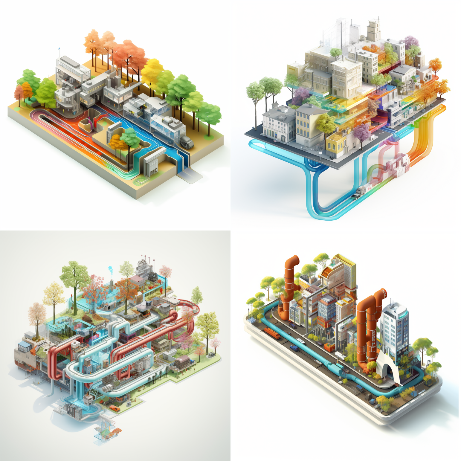
These images at c25 are close to our original, at least spiritually, if not aesthetically. I’ve noticed that it’s easy to get good renderings of individual buildings, but city blocks can be tough because of Midjourney’s inability to understand the way discrete systems work (edges of a parking lot with a curb, for example). What’s the most interesting to me about how the model interpreted the prompt under moderate chaos is the way it has maintained core elements (these are all very clearly some sort of urban systems), but removed others (#2 includes no buildings, #1 no pipes, #3 also no buildings, and #4 not much in the way of color).
This is at c 45, so we still have a bit of logical glue from our original prompt (#1-3, not so much for #4). #4 is still a cluster of houses. Unclear what the rainbow ring is doing. Unless… maybe.
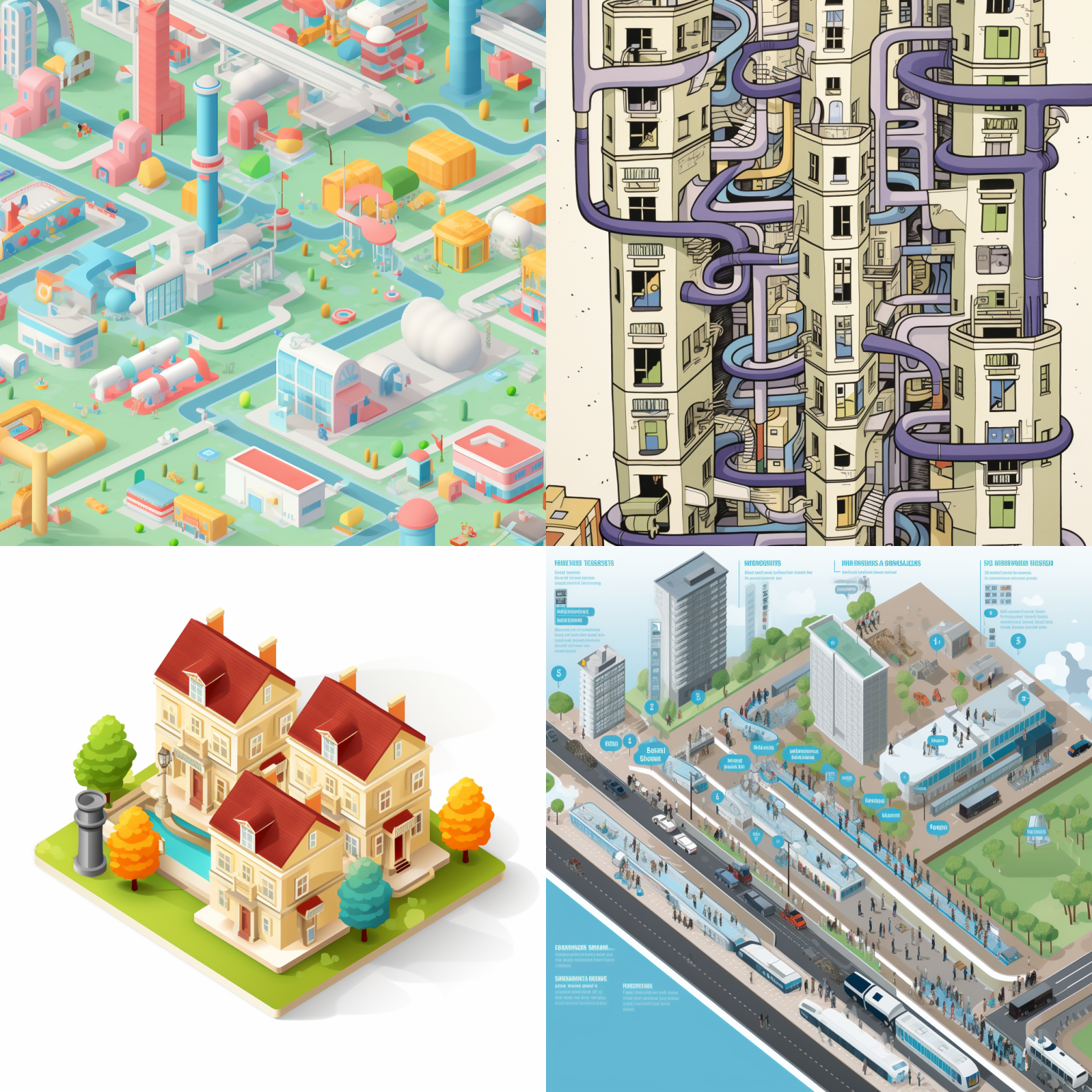
We have now devolved. We see inklings of the pipe-and-tube-and-city infrastructure that were present in previous iterations in #1 and #2. #4, meanwhile, is still some sort of city– drawn from a diagrammatic illustration (evidenced in the text blocks), but it doesn’t seem to have much of the speculative, colorful elements that we previously saw. I am not sure what’s happening with our weird little Georgian cottage court (that has a streetlight in the middle of a reflecting pond). #2 makes me think of Zozo.
This last one is at c 100. Cool! I have no clue what’s going on! With the exception of #4, which prominently features a bunch of pipes and tubes that might loosely resemble infrastructure, these have virtually no bearing on what the original prompt was meant to be.
Conclusions
You don’t need to worry about the quality parameter unless you’re actively getting lower quality images. Remember that I’m talking about the rendered quality of the image, not “getting what you want.” Quality simply spends more time on the “finishing” part of it– it doesn’t change what image data go into the finished product. However, chaos and style can be fun parameters to mess around with because they change the definition of the subject matter of the image. In the case of the chaos parameter, it can be used to spice up your subject matter (unpredictably, in many cases, and beneficially!), while the style parameter moves you from Star Trek TOS to JJ Abrams. Play around with it and follow along for more content on AI!
This article will be posted with the rest of my AI content, where I have a bunch of fun stuff I’ve been messing around with.