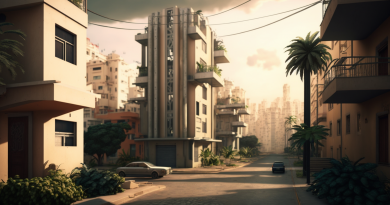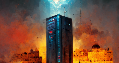
Midjourney: The Imagination of the Sane, the Insane, and the Unseen
I’ve been taking a short break from writing about urbanism and sustainable planning, mostly because I’ve fallen into a deep state of depression and despair over the fact that most Michiganders are either climate denialists (Republicans) or think that we can decarbonize transportation by building electric Cadillacs that no one can afford and that will, yes, still kill people and still pollute (Democrats). So, I’ve turned my attention to the next hottest thing: artificial intelligence models like Midjourney and ChatGPT! Today, we’ll be discussing how to use Midjourney (or not) for things that might be lacking in AI training. In other words, we’re going to be talking about how to do the things that Midjourney doesn’t seem to do terribly well!
Introduction: How Does Midjourney Work?
To the uninitiated, Midjourney is an AI model that produces images. It does this through a complex and mysterious process, responding to prompts entered by folks like you and me. Perhaps the most common question in discussion forums about Midjourney is, “how can I get [x] to look perfect?” It’s usually someone trying to render an exact image of a face. Often someone wants to create exact text (good luck, kid!). Sometimes the person wants to copy something precisely, exactly. How do you do it?
The answer? Simply put, you can’t usually get something to be exact. But this is more complicated than just the model being able or unable to do something. The model relies on a combination of algorithms that utilize both stochastics, statistical inference, and more. As the AI’s progenitors have tasked the model with not only understanding human language, but also then translating it into legible, recognizable images,
I’ve noticed that Midjourney is really bad at rendering spatial structures that involve very clear points of beginning and ending. In other words, we’re not talking about rendering a Thomas Kincaid painting, but rather something like pipes, telephone poles, or streets. As a city planner dabbling in AI, this is enormously frustrating, but it’s instructive since it shows that the AI model “understands” images in terms of what they look like, not in terms of the logical continuity or structure of systems. We will return to this in a moment.
Prompts For The Unseen
/imagine isometric rendering on a white background, isometric rendering of a leviton decora switchThe problem with some objects or things– things that you might want to attempt to recreate- is that often we are trying to create images of things that the average person doesn’t even understand the spatial parameters of, so, therefore, a robot is also unlikely to understand it. I am thinking about things that we see part of, but not all of. I had this issue when making train track configurations for my Crazy German People And Their Trains article. Yesterday, I attempted to create a simple thing that is in every American home: a light switch! However, I wanted to create a specific kind of light switch, and I wanted to create it in isometric view (which I might refer to as “Sim City” view in lay terms, as opposed to perspective view, where things that are farther away are smaller).
There are a lot of prompt writers who seem to believe that, in the interest of precision, more is more. These are the folks that usually write some sprawling, prosaic thing that goes on forever, lacks substance, for the most part, and looks like the text equivalent of a Florida suburb. These things sometimes work. The model does interpret human language, after all, so it will at least “look” at all of the words! But while this is often superfluous, it’s also important to note that less is not necessarily more. I quest to be as specific as possible in as few words as possible. This is especially ironic coming from the (self-styled) queen of the parenthetical aside.
But here’s what I mean. In the below series, I have included three quads for each image series. (For every prompt, Midjourney renders images in four quadrants, and you can either “re-roll” or pick the ones you like most, either to upscale or to create variations on). I will be referring to these based on their sequence, so, 1, 2, 3, 4, starting at the top left and continuing from left to right on the top (1 & 2), then on the bottom (3 & 4).

Step 1. Developing and Refining A Simple Prompt
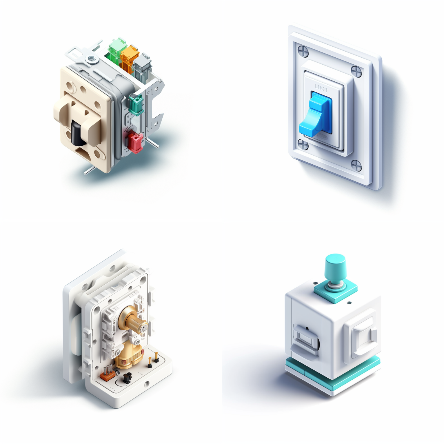
The first series were based on variations of simple prompts, corresponding to the first, second, and third prompts below. I wanted to stick to isometric first.
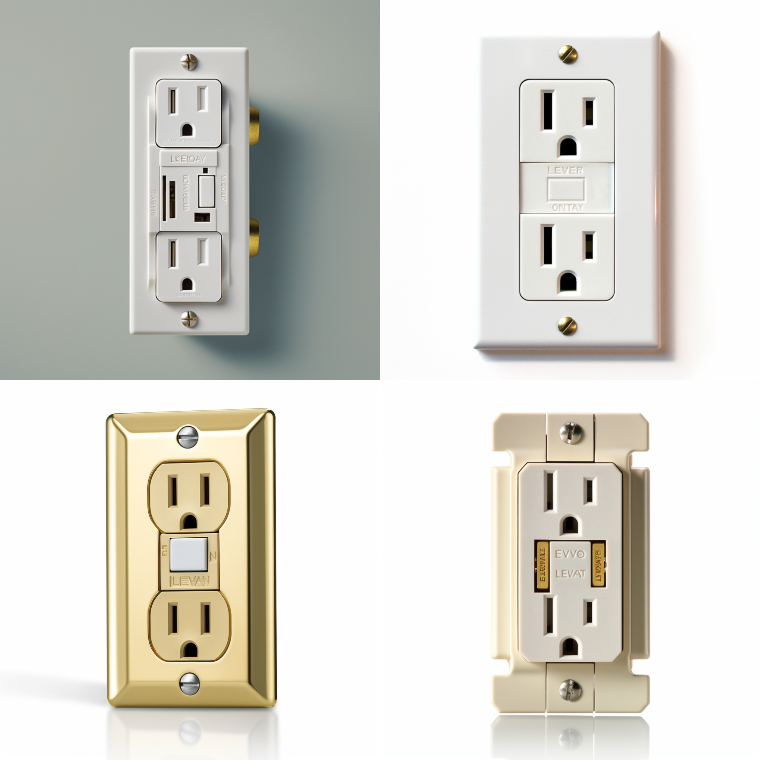
/imagine prompt: isometric rendering on a white background, isometric illustration of a white Leviton switch/imagine prompt: isometric rendering on a white background, isometric rendering of a decorator light switch/imagine prompt: isometric rendering on a white background, isometric illustration of a white Leviton decora light switchNote that from left to right across the three, these seem to go from more vague and more abstract to more specific, closer to what looks like a real switch. You don’t have to be a DIY home rehabber to know that, in fact, none of these actually look like light switches. I especially like the sort of Middle Eastern one (#3 in Quad #2, center), or #4 in that same series that looks more like a circuitboard. #4 in the first quad looks like a button rather than a light switch. Perhaps I should have specified something other than “decorator,” although I thought this was a common enough term that Midjourney would understand it! For the last one, I switched to “Leviton Decora” switch. To no avail!
Step 2. Refining.
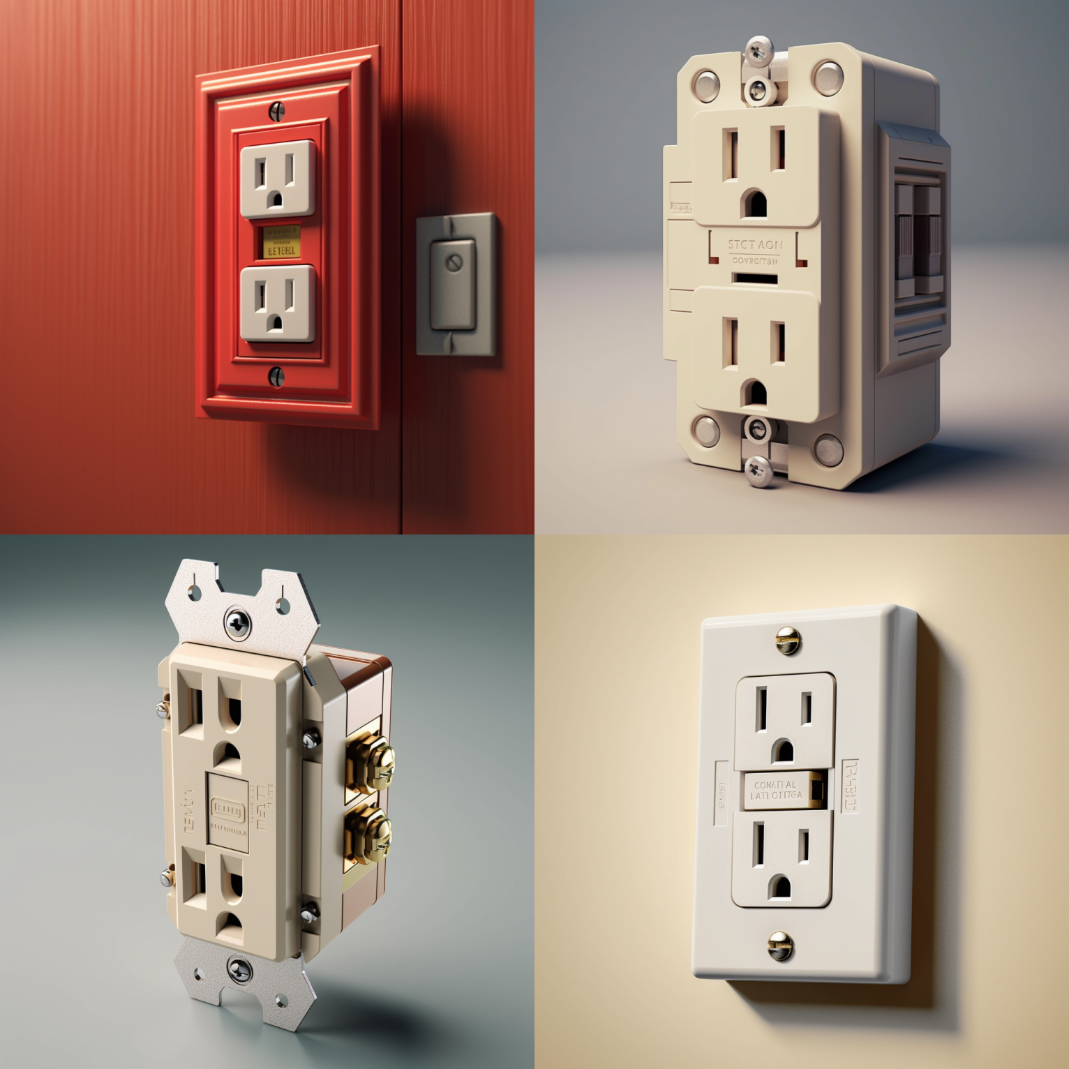
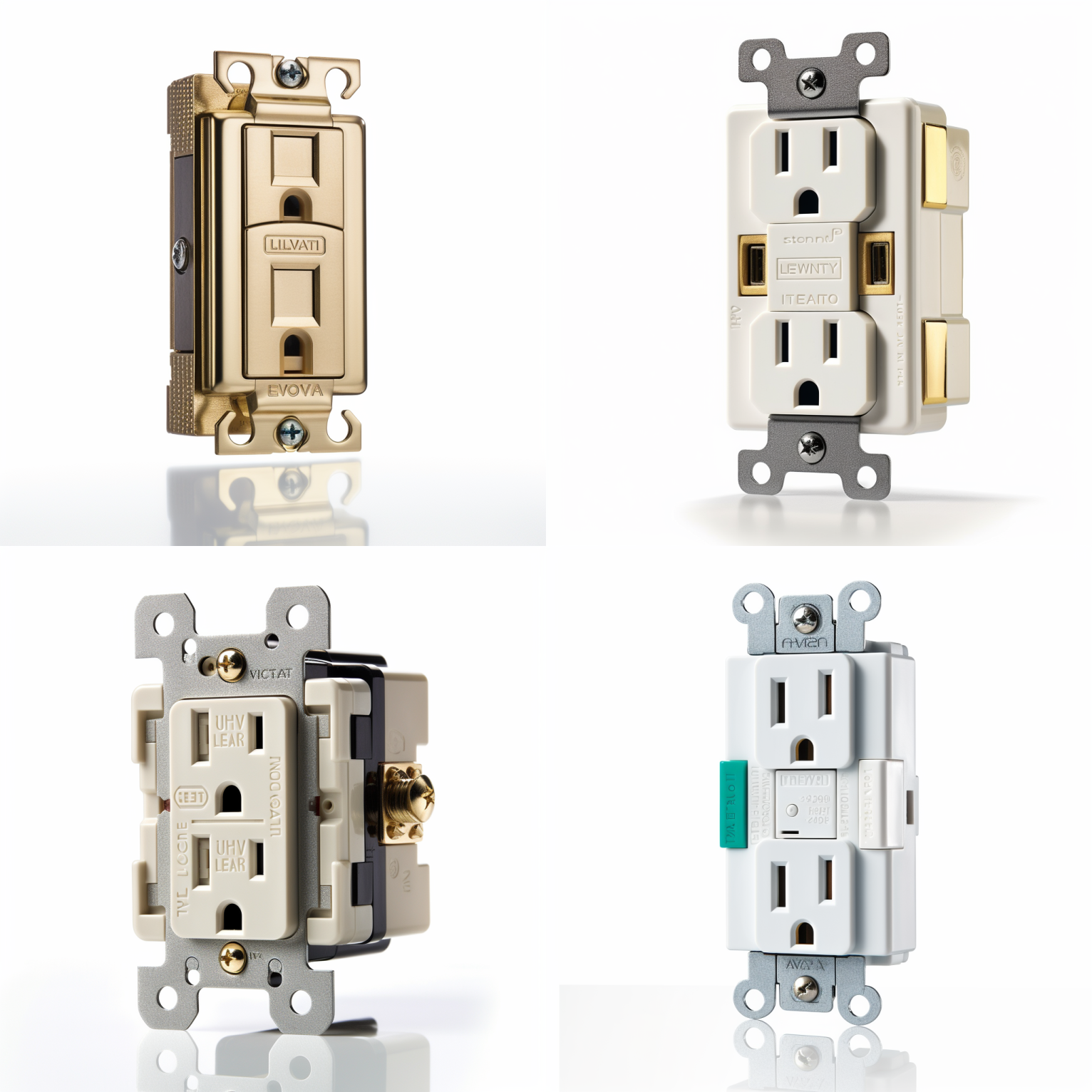
Striking out in isometric-ville, I eventually decided to to scrap that part of the prompt. These next three are based on the following three prompts. I added “receptacle” and I removed “isometric.” “Receptacle” is the technical term for an outlet, so I wanted to see whether Midjourney would “get” this, having probably been trained on a bazillion images from Home Despot and Lowes.
/imagine prompt: isometric, Leviton decora light switch receptacle/imagine prompt: Leviton decora light switch receptacle/imagine prompt: Leviton decora light switch receptacleNote that while these all look a lot more like real outlets, they don’t look like switches. I included “receptacle” because I knew it was a more technical descriptor. But a switch isn’t a receptacle and I wasn’t sure how to get the more technical descriptor in there. They are, however, a lot more believable!

Step 3. Finishing.
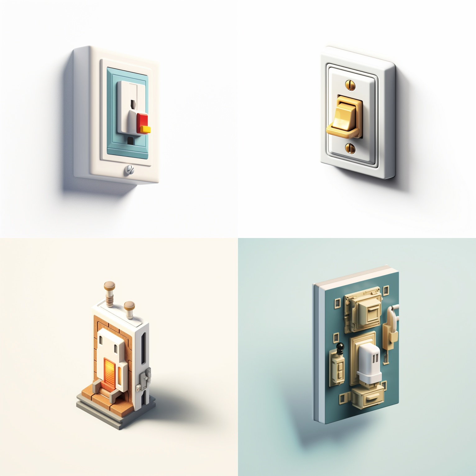
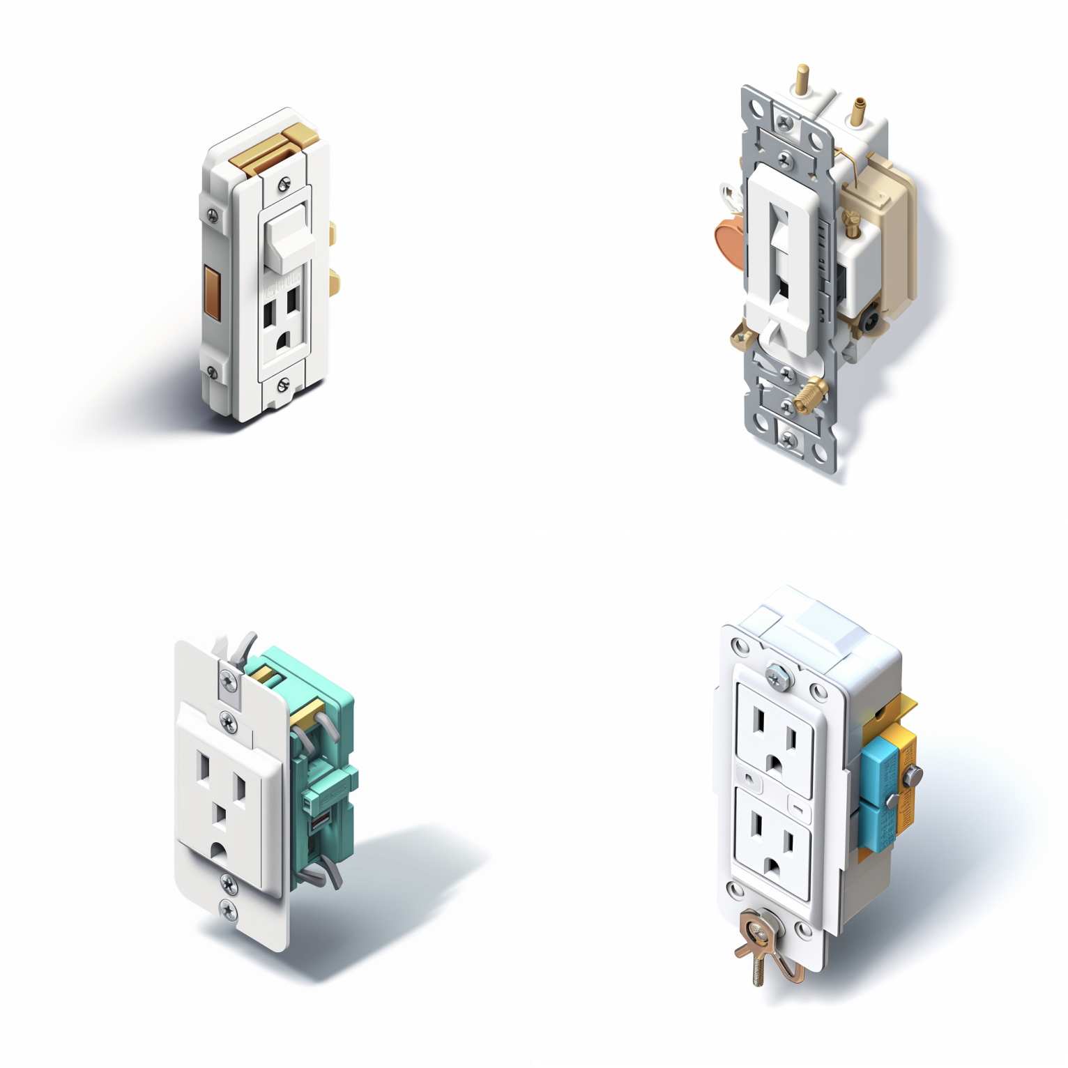
What’s nice about the quads is that sometimes it’ll come up with something that seems completely insane but perfect, or, three things that are completely insane, but one thing that is exactly what you wanted. You can control the stochastic “slider” by adding into the prompt the text “–c #”, where “#” is a value from 1-100, of what kind of “chaos” you want. I didn’t try that on this one, but I use it frequently if I’m trying to push the limits of credulity or creativity. The chaos parameter in Midjourney often generates bizarre stuff. But it’s always worth a roll.
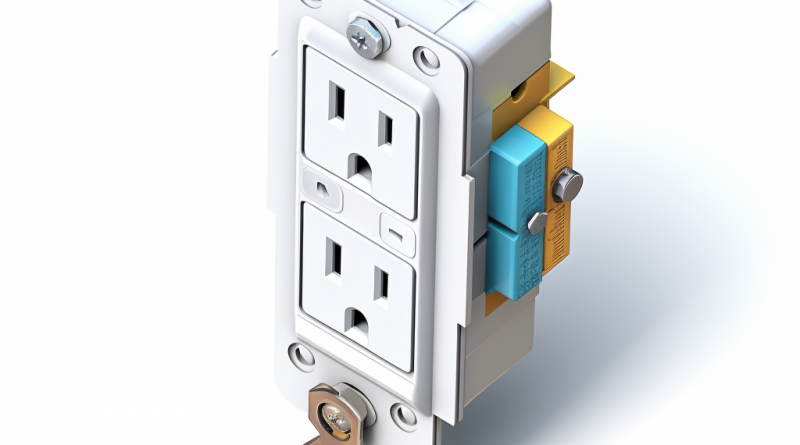
In this last series, I found the one that I really liked (#4 of the first quad), and I refined it by asking Midjourney to create variations (center), finally upscaling the one I liked most. Note that in the first image, the top right switch doesn’t look particularly ergonomic, while the bottom left switch has not one, but two grounding plugs. Midjourney, of course, doesn’t know this, because it’s hard to specify quantities. The average switch in North America has six holes. The switch it created in #3 in the first quad has four holes. Curious.
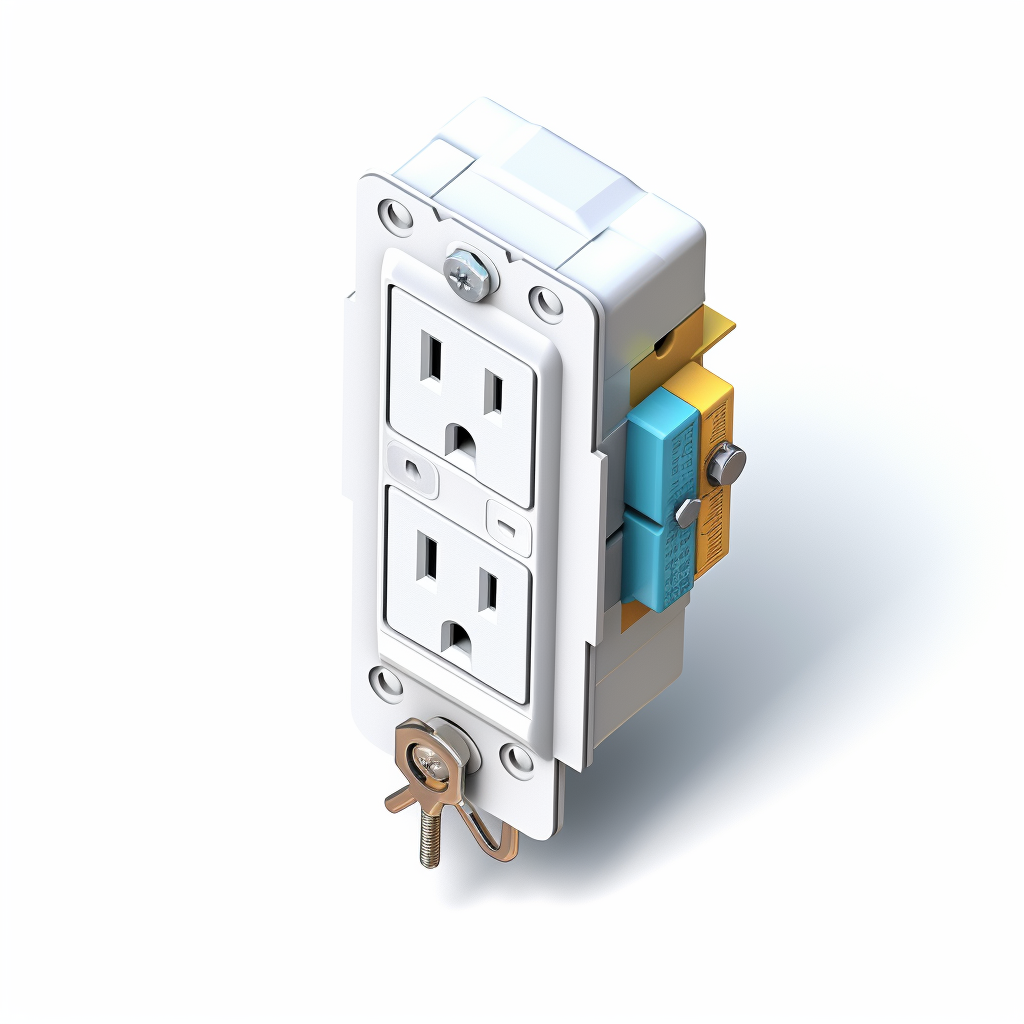
What I particularly like about these is that the final rendering has a couple of features that I explicitly wanted to make it look like a realistic part: the two-colored terminals on the right side are visually pleasing, but also potentially valuable as a matter of product ergonomics, something the construction industry sucks at. Receptacles are all wired with black (hot) and white (neutral) wires, and, on switched circuits, occasionally a traveller wire, which is a third color (usually red, but could be other colors).
Notably, though, since including the “receptacle” language, while I was able to get a more accurate rendering, I didn’t end up getting a light switch. I got an outlet. It’s a beautiful outlet, but it’s not a switch. And I’m satisfied with it, irrespective of whether it’s what I originally wanted. This is a great example of how Midjourney often works. Sometimes, the Midjourney is the destination.
Learn more about Midjourney. Or follow along with our series! Become a contributor to Handbuilt City today!